Making Scientific Computing Accessible for Everyone
Julia Hub is a high-performance computing platform designed for researchers and data scientists to run complex scientific computations efficiently. Despite its powerful capabilities, users faced challenges navigating the platform, managing computational resources, and integrating workflows seamlessly.
This case study outlines my process of improving Julia Hub’s usability, navigation, and overall user experience through a human-centered redesign.
Julia Hub
UX UI Design Consultant
Scientific / Cloud Computing
2023 - 2024
Goal
Design an intuitive and accessible platform that empowers scientific researchers to run, visualize, and share complex computations without technical barriers.
Challenge
Scientific computing platforms often prioritize power over usability, leading to a steep learning curve. Julia Hub was no exception—users struggled with:
Technical complexity – The platform was feature-rich but not intuitive for new users.
Fragmented workflows – Users had to switch between multiple tools, slowing down productivity.
Difficult resource management – Tracking and optimizing computational resources was cumbersome.
Steep learning curve – The interface lacked clear guidance, making onboarding challenging.
My Role & Responsibilities
As the UX/UI Designer on this project, I was responsible for:
User research – Understanding key user pain points and behaviors.
Information architecture & navigation redesign – Simplifying access to key features.
UI/UX design – Creating a more intuitive and accessible interface.
Prototyping & usability testing – Iterating designs based on user feedback.
Collaboration with developers – Ensuring design feasibility and implementation.
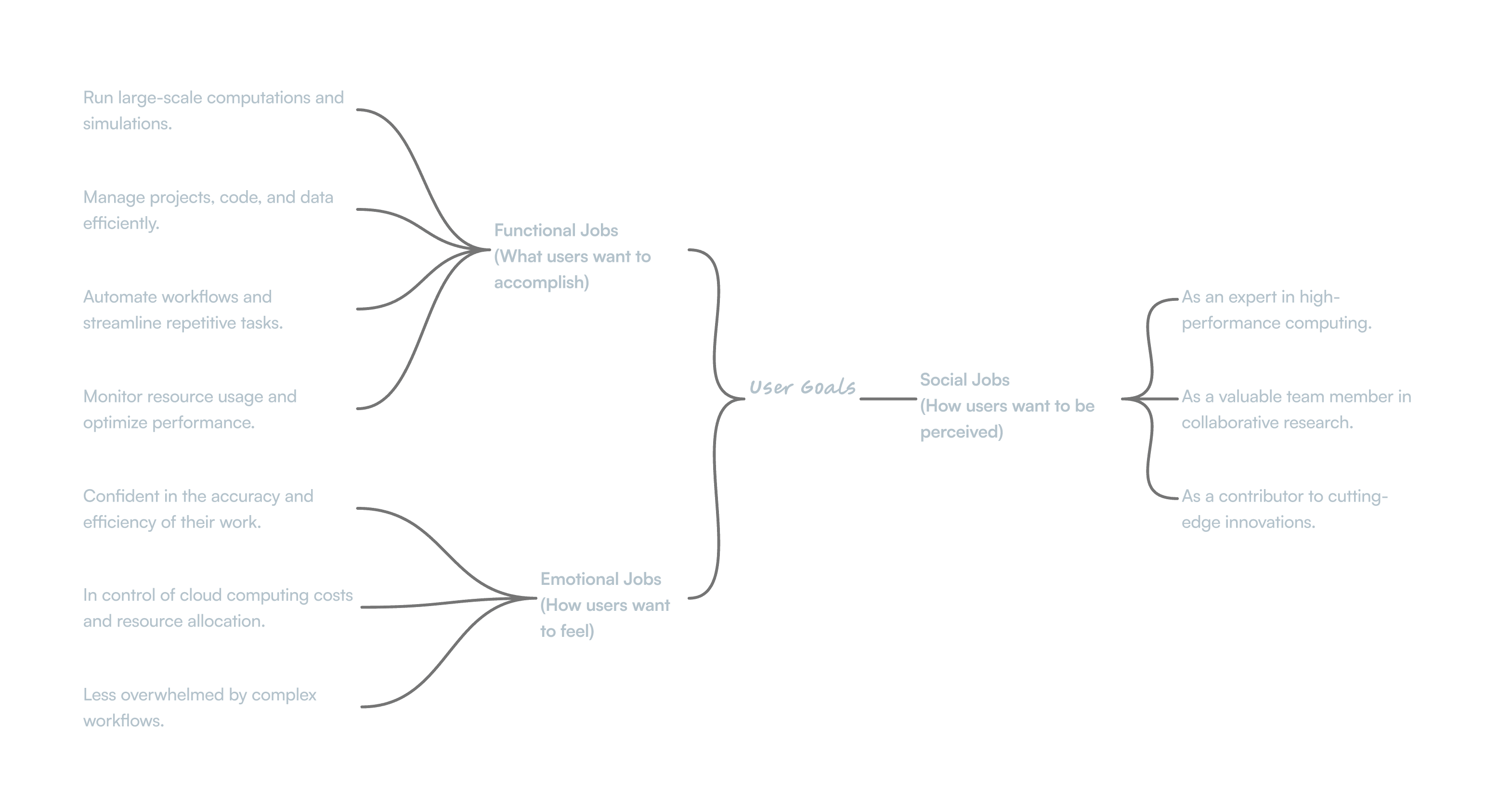
Target Users
“ I need a Platform That Can Handle Complex Genomic Data Analysis Without Requiring Me To Become a System Administrator. ”
Phd-Level Researcher, Biomedical Computing
“ I Need To Run Large-Scale Experiments Efficiently Without Worrying About Infrastructure Costs Spiraling Out of Control. ”
Machine Learning Engineer
Getting to Know the Users
To ensure my design decisions were data-driven, I conducted qualitative and quantitative research, including:
Contextual Inquiry
I observed researchers in their work environments to understand their workflow, pain points, and tool usage. The findings revealed that many relied on external applications for visualization and computation management, leading to inefficiencies.
Card Sorting for Information Architecture
To improve navigation and information architecture, I conducted card sorting exercises with representative users. The results showed a strong preference for organizing features around:
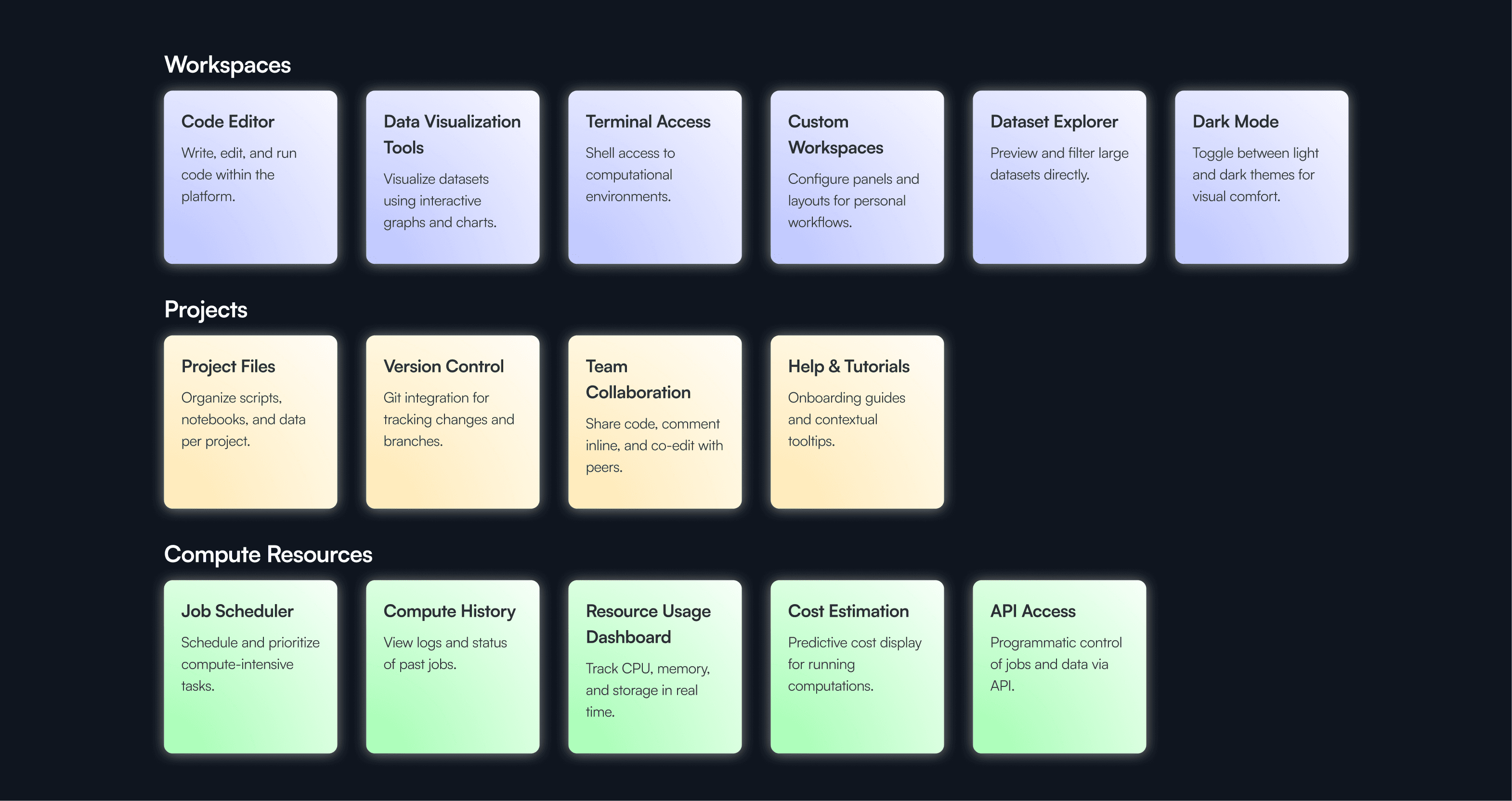
✔ Workspaces – Dedicated research environments.
✔ Projects – For collaboration and version control.
✔ Compute Resources – A centralized dashboard for managing computation power.These insights formed the foundation of my navigation redesign.
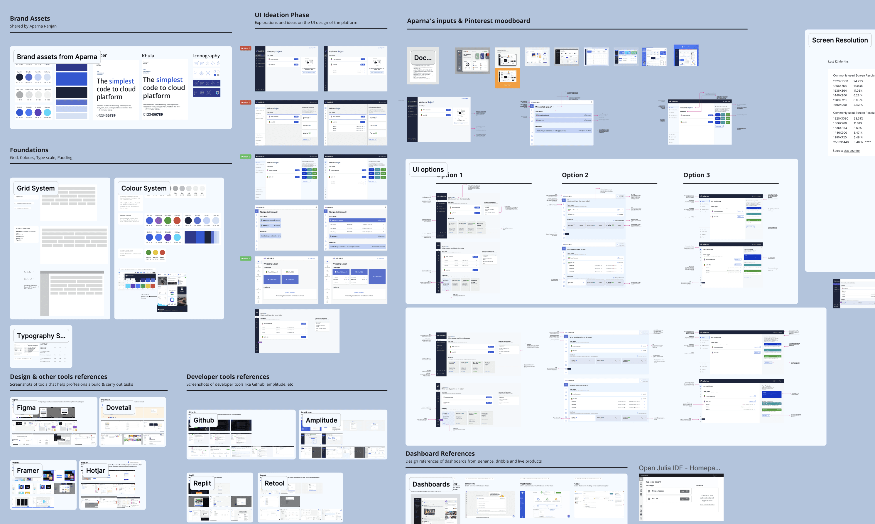
The Design Journey
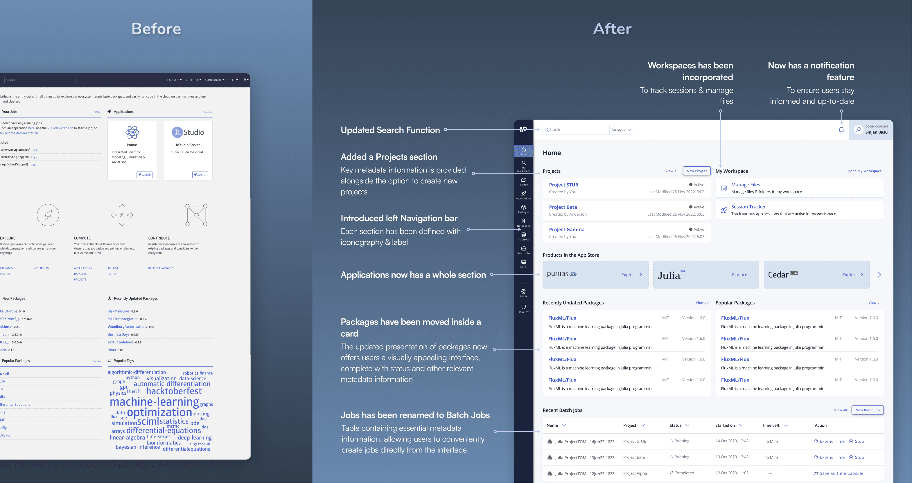
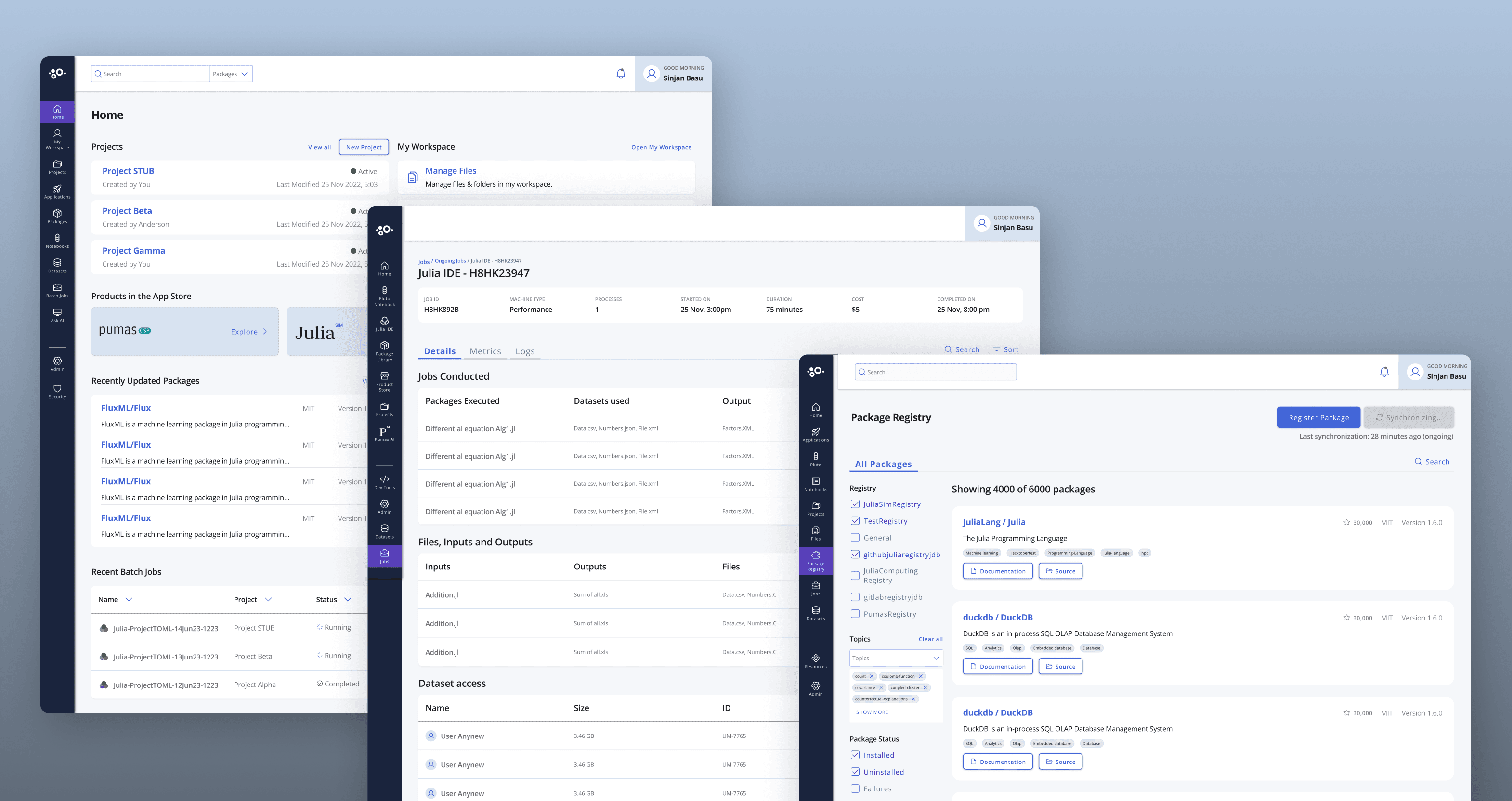
Information Architecture & Navigation Overhaul
I restructured the platform’s navigation to create a more intuitive experience, focusing on progressive disclosure to gradually introduce complexity.
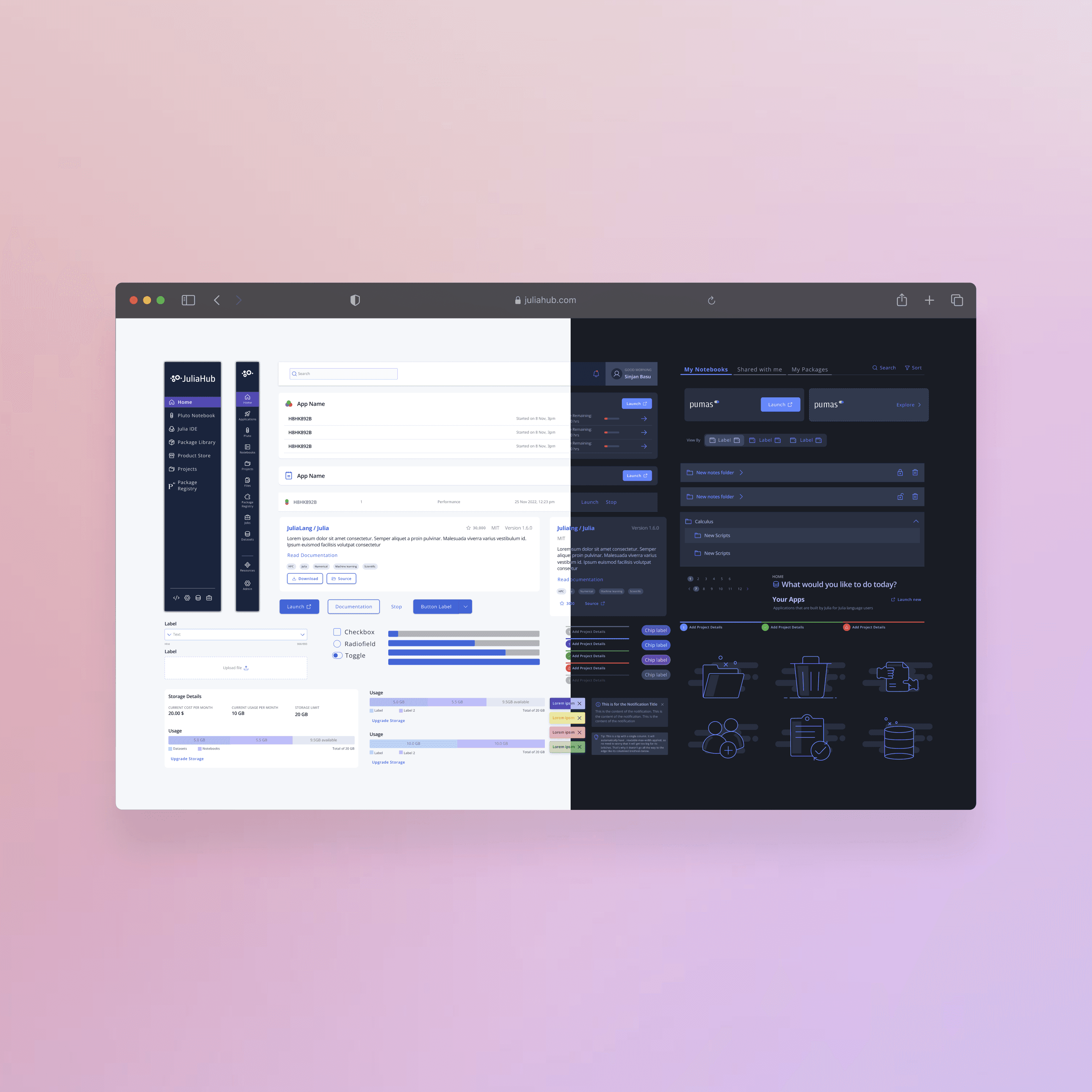
New Sidebar Navigation: Workspaces, Projects, and Compute Resources as primary categories.
Dashboard Simplification: A one-glance overview of active projects, running computations, and available resources.
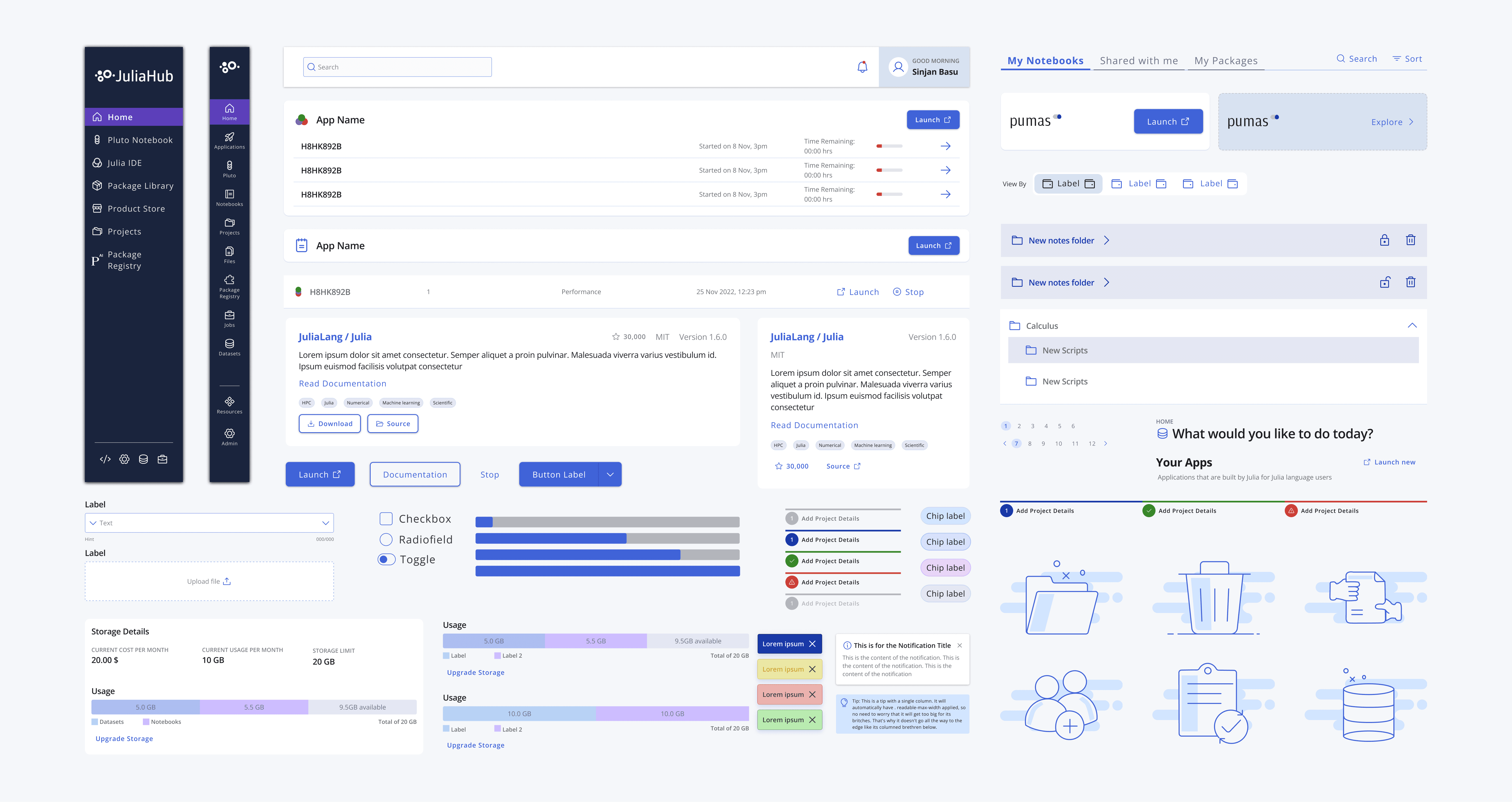
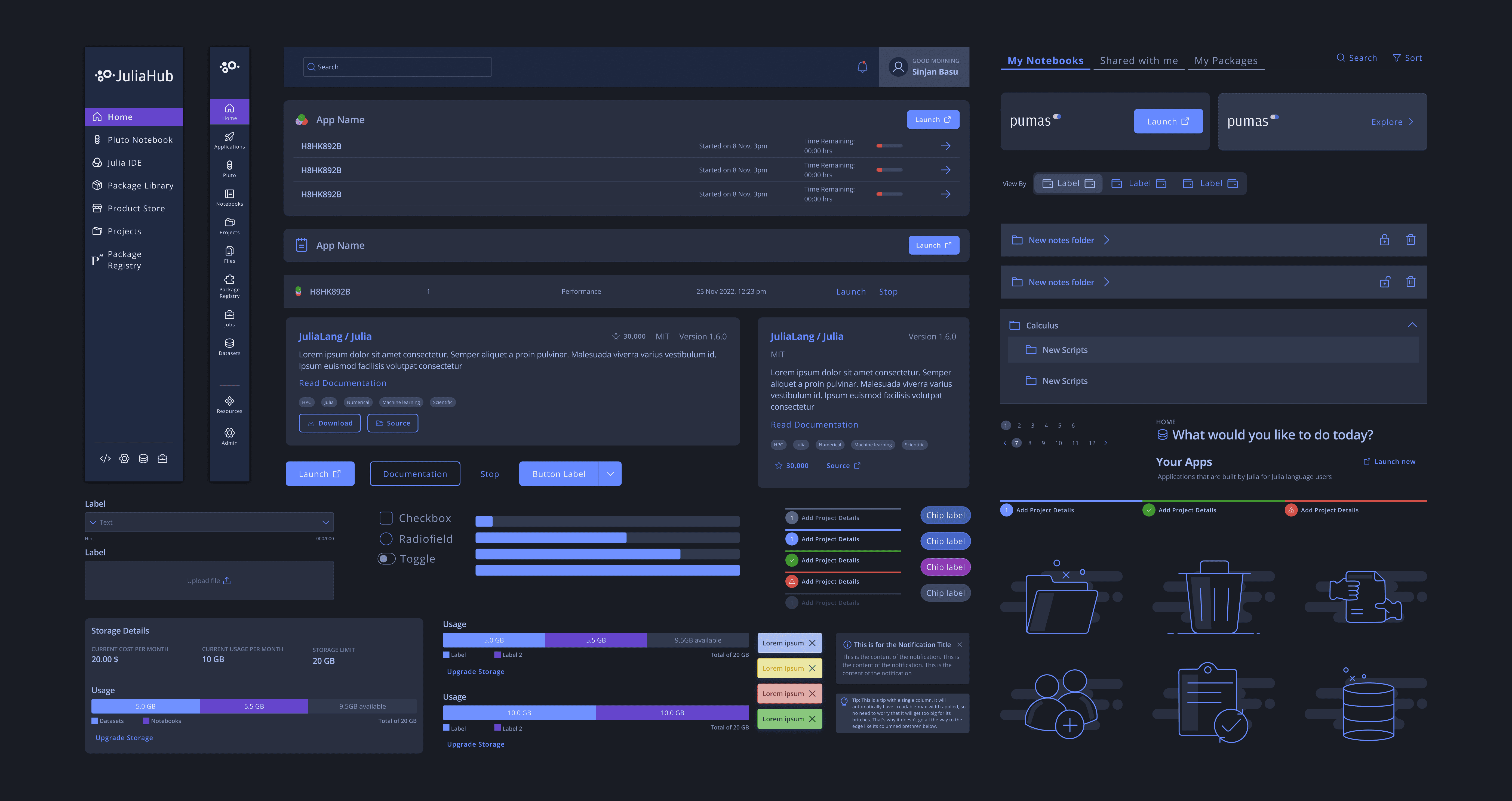
UI Design System & Visual Enhancements
To improve usability and accessibility, I created a unified design system for Julia Hub that established consistent patterns, visual hierarchy, and accessibility standards.
Color-coded status indicators for computation states.
Typography improvements for better readability (Open Sans for general UI, JetBrains Mono for code).
Refined layout and spacing for a cleaner, more focused UI.
This design system not only elevated Julia Hub’s user experience but also laid the foundation for a scalable, brand-consistent visual language across the Julia ecosystem.

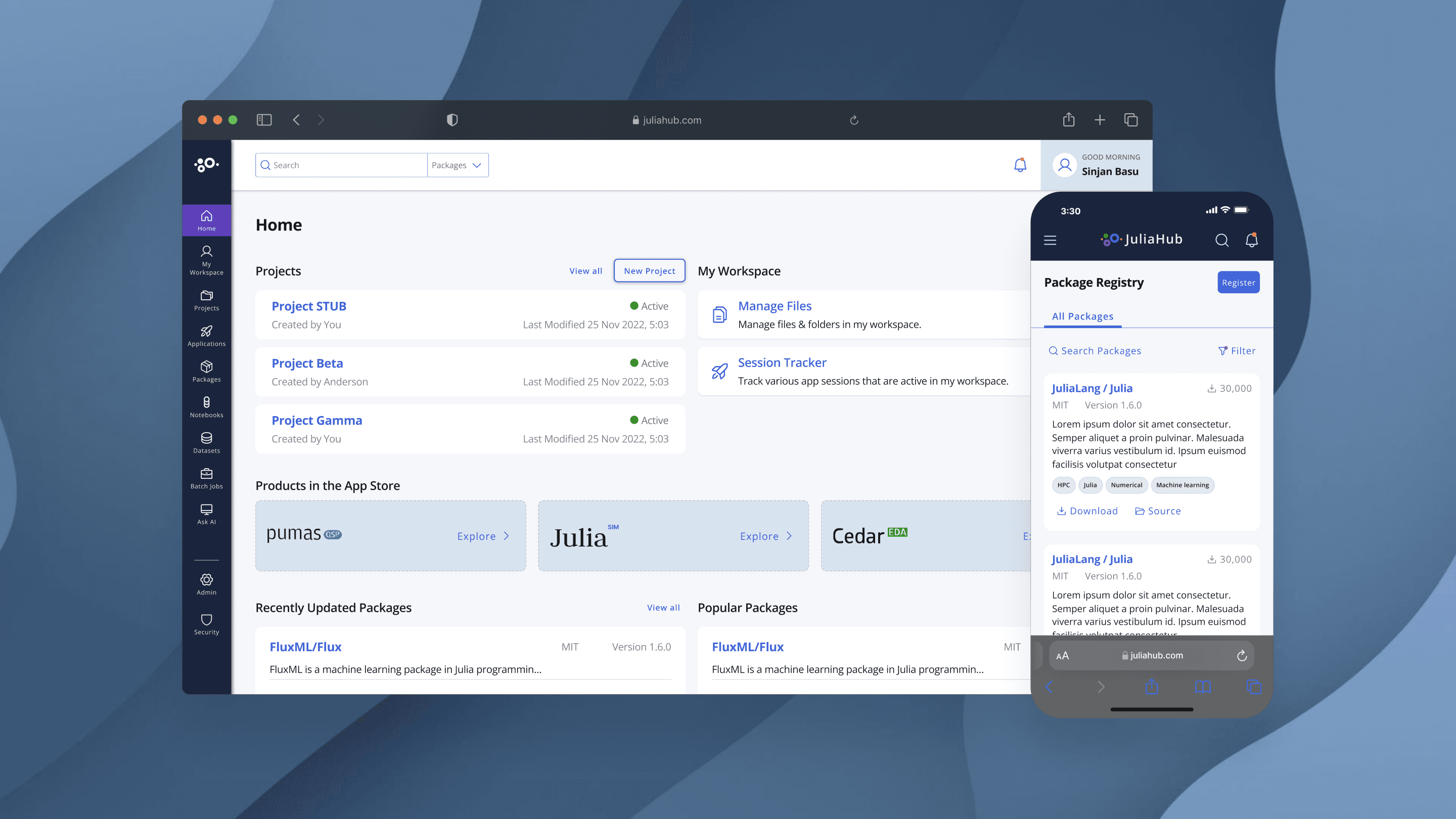
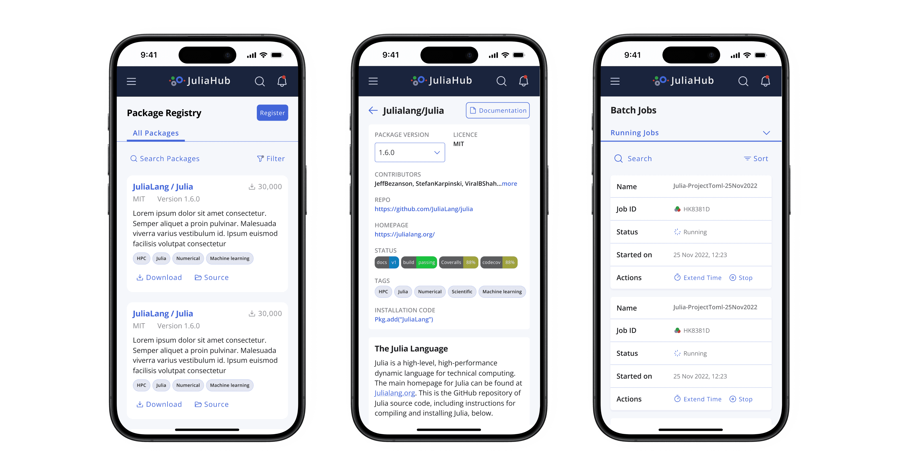
Responsive Design for Seamless Access
Since researchers often work across multiple devices, I ensured that Julia Hub was fully responsive, providing a seamless experience on desktops, tablets, and mobile devices.
Key improvements included:
✔ Adaptive Layouts – The interface dynamically adjusts based on screen size, ensuring usability across different devices.
✔ Touch-friendly Interactions – Optimized UI elements for mobile usability, including larger buttons and swipe gestures.
✔ Mobile-Friendly Navigation – A collapsible menu structure for efficient browsing on smaller screens.
✔ Consistent Performance – Smooth transitions and fast load times, even on mobile networks.With these enhancements, users could access their research, manage computations, and monitor resources effortlessly—anytime, anywhere.
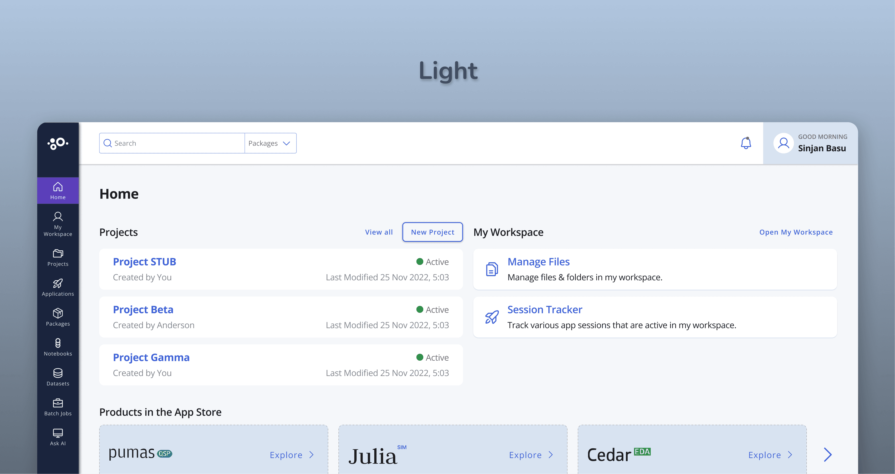
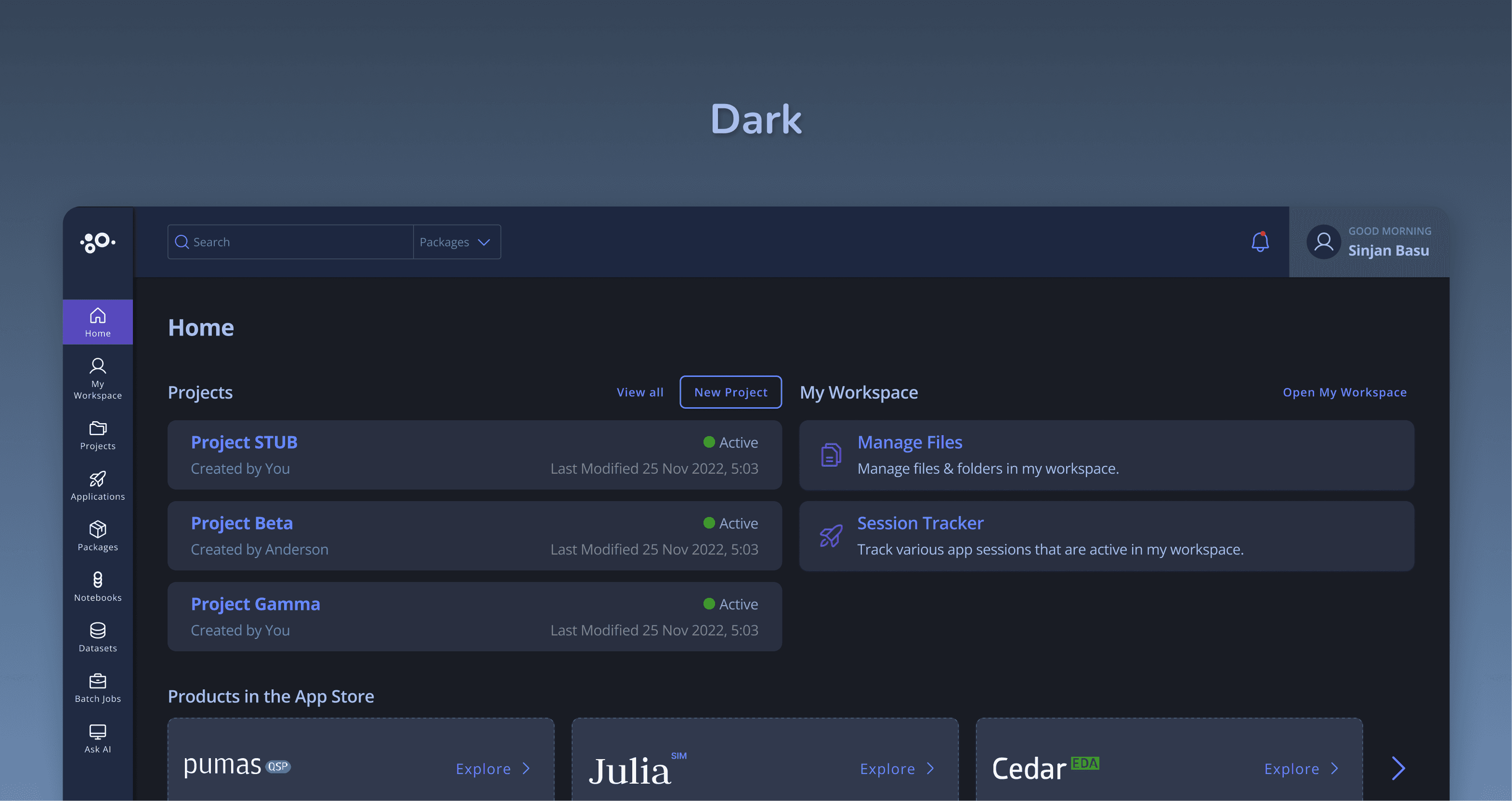
Accessibility & Onboarding Improvements
To lower the learning curve, I integrated:
High-contrast mode & keyboard navigation for accessibility compliance.
Embedded tooltips & inline guidance for new users.
Dark mode for better readability during long coding sessions.
Key Takeaways
This project reinforced several UX principles:
✔ Simplify Complexity – Making powerful features easy to use increases adoption.
✔ Design for Progressive Disclosure – Introducing complexity gradually prevents overwhelm.
✔ Visual Feedback Matters – Clear indicators help users interpret abstract data.
✔ Onboarding is Key – Interactive guidance is more effective than static documentation.
Final Thoughts
By focusing on user needs and employing a rigorous design process, the Julia Hub redesign successfully transformed a powerful but complex platform into an accessible and empowering tool for scientific discovery. This project demonstrates my commitment to creating user-centered solutions that drive tangible results.